
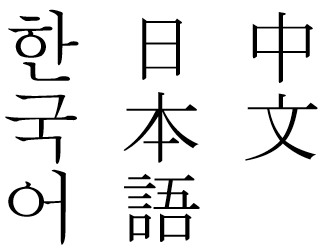
I mean, you can write in Chinese, Japanese or Korean vertically and the text remains legible they’re logographic (except Korean) so for both Chinese or Japanese: the nature of the writing system allows it for that level of flexibility when it comes to displaying text either vertically (R-L) or horizontally (L-R) while languages that use the Latin alphabet remain rigid on horizontal writing orientation only.
As in, you can display a Chinese or Japanese sentence top to bottom in vertical orientation but doing that with Latin-based languages (like English or French) makes it look crap. Today that form of writing still exists, Japanese has it in Manga where the text is formatted vertically and in Chinese it’s used for signage or pillars (Korean can be displayed in that format but it remains rare today).
As for why it looks like crap, tbh it’s likely just because our letters are very thin. Vertically, an l would take the same space in the line as an ー which makes absolutely no sense and makes the lines look like enshittified junk food. On the other hand, the characters in the languages you showed are squarish, which means that they look good in both orientations.
As for why it’s hard to read, as someone who’s learning japanese, it’s likely because people are just not used to it. While I started reading R-L fairly early in my learning journey and had no problem getting used to it, I had a friend who only started reading R-L after he was already pretty much fluent in the language, and he told me that he found reading it a little tricky despite reading L-R no problem. I assume that he read words, not letters, and reading in an orientation he was not used to threw him off. On the other hand, I was still learning so I read each character individually, which was why I didn’t feel much of a difference.