

Linux is down slightly after a peak month, but probably that month had Linux over-represented. This month we see English down a bit too, Chinese is up a little.
https://store.steampowered.com/hwsurvey/Steam-Hardware-Software-Survey-Welcome-to-Steam
https://www.gamingonlinux.com/steam-tracker/
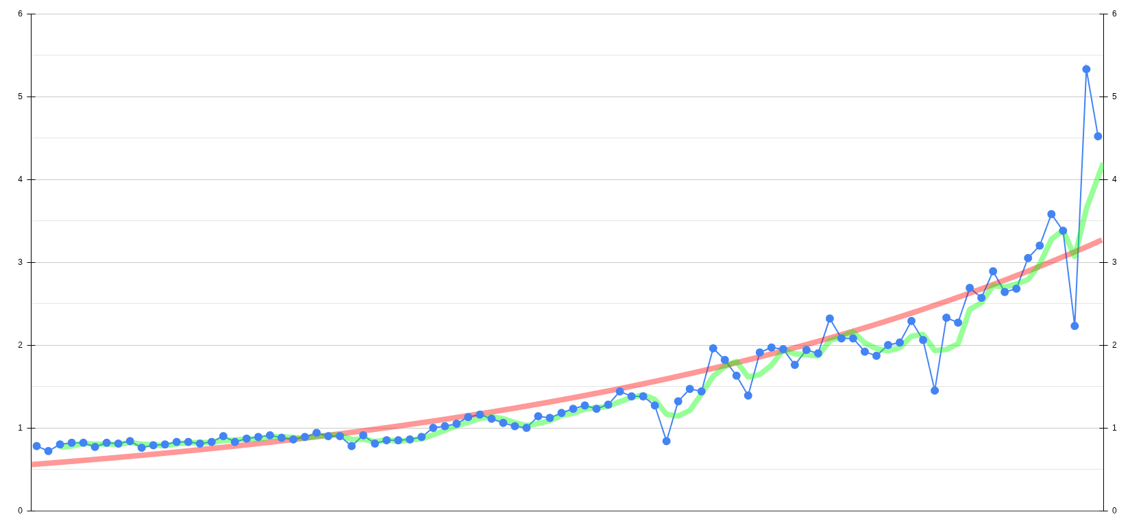
I copied the data from gamingonlinux and put it into my own sheet with an exponential trendline (red) and a moving average line (green) to smooth out the variance of the survey. We’re definitely trending upwards.
Here’s the csv data
0.78, 0.72, 0.80, 0.82, 0.82, 0.77, 0.82, 0.81, 0.84, 0.76, 0.79, 0.80, 0.83, 0.83, 0.81, 0.83, 0.90, 0.83, 0.87, 0.89, 0.91, 0.88, 0.86, 0.89, 0.94, 0.90, 0.90, 0.78, 0.91, 0.81, 0.85, 0.85, 0.86, 0.89, 1.00, 1.02, 1.05, 1.13, 1.16, 1.11, 1.06, 1.02, 1.00, 1.14, 1.12, 1.18, 1.23, 1.27, 1.23, 1.28, 1.44, 1.38, 1.38, 1.27, 0.84, 1.32, 1.47, 1.44, 1.96, 1.82, 1.63, 1.39, 1.91, 1.97, 1.95, 1.76, 1.94, 1.90, 2.32, 2.08, 2.08, 1.92, 1.87, 2.00, 2.03, 2.29, 2.06, 1.45, 2.33, 2.27, 2.69, 2.57, 2.89, 2.64, 2.68, 3.05, 3.20, 3.58, 3.38, 2.23, 5.33, 4.52
What exactly is misleading in your opinion? The red line looks fine to me. It’s not there to represent the exact figure at any given moment, but it’s smoothed out (extremely) to have a curve to see a trend.
Do you really need a line to see the trend? Also, the trend has been much more explosive in the last data points, with an exponential line like OP said they used you can fit it much better.
It’s misleading because that line doesn’t properly represent the way the trend is increasing at the end. It’s not a big deal tho.
I don’t think we “need” a trend line, nor adds any true value at the moment. But that does not matter for our discussion we have.
The line does actually represent the trend correctly, even at the end. Trend lines are like averages, they are never correct at any given time in the sense that they do not represent the current value. Even if there are huge fluctuations at the end, the trend tries to smooth it out over long period of “time”. It is only misleading, if you expect the line to represent the current value. But that’s not the point of a trend line. Usually trend lines are not overlapped with real values, as it looks confusing. Trend lines are there to simplify the look and to see a trend immediately over longer period of times.